The Apollo 11 Photo, Explained

071619-Apollo-Photo-HF02_Social 5

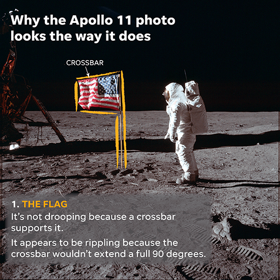
I did an interactive chart and a couple of promotional images for this story on one of the iconic photos of the Apollo 11 moon landing. The piece addressed the various items you see in the photo and explains why they look the way they do.

Even 50 years after the landing, conspiracy theorists still insist it was faked, as if the space program is only a Capricorn One event. The items noted in the photo are often invoked to support this viewpoint.

The chart is here. This is the first panel:

071619-Apollo-Photo11


This entry was posted in Graphics and tagged , . Bookmark the permalink.

Leave a Reply

Fill in your details below or click an icon to log in:

WordPress.com Logo

You are commenting using your WordPress.com account. Log Out /  Change )

Twitter picture

You are commenting using your Twitter account. Log Out /  Change )

Facebook photo

You are commenting using your Facebook account. Log Out /  Change )

Connecting to %s