Clear, Concise Explanations are Best

USATabXTR_XTR_5_07-01-2013_0_6_B_Z_006_4_114445 (1)

This was a graphic I advocated for a USA TODAY publication that looked back on the Korean War. The publication contained excellent stories about veterans from all 50 states and their experiences, but I felt strongly that we should clearly explain why we were in Korea in the first place.

Graphic artist Julie Snider did a bang-up job of putting this together. In addition to the design, I did the research for all the text you see here.

Posted in Graphics | Leave a comment

Banks May Fall Short of Regulatory Requirements

01.23.COD.Basel6

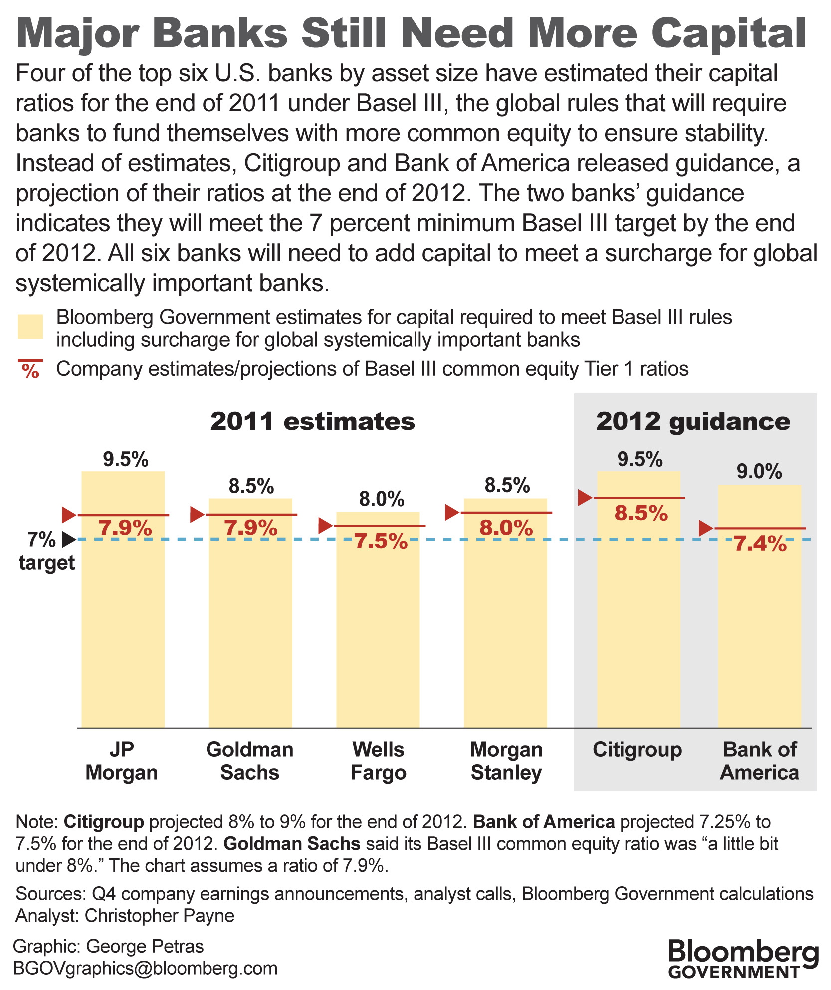
This is one of those graphics that walk a fine line between serving financially savvy subscribers and newcomers who may be unfamiliar with regulations on banks. It’s complicated but important, since we’re talking about banks whose failures could cause a financial crisis.

In essence, Basel III (it’s pronounced bay-zil, like the actor Basil Rathbone) is a global standard requiring banks to reserve a specified amount of common equity — cash or common stock — based on their sizes and assets, to cover themselves against future risk.

Banks would have to put aside more of their own equity to pay for losses caused by their own faulty decisions or unpredictable market fluctuations. The hope is that banks would think twice before entering into risky ventures, since more of their own money is at stake. The reserve would also reduce the necessity for government bailouts or other intervention.

This 2011 graphic shows the estimates of six major U.S. banks for their capital ratios, the ratio of capital to assets, or net worth to everything they own, including liabilities. All six estimate they will exceed the basic Basel III requirement of 7%.

However, the graphic notes the banks will also need to improve their capital ratios, from 1% to 2.5% according to Bloomberg analysis, for an additional charge levied on large banks with significant global connections. So that additional charge could prove difficult for the banks, notably JP Morgan and Citgroup.

That’s a lot of explanation for a relatively small graphic. I worked with Christopher Payne, a brilliant financial analyst whose story this chart accompanied, to whittle down the text and still retain pertinent facts. I would not say the graphic is perfect, but I think the cognoscenti and the newbies can find useful information here.

Posted in Graphics | Leave a comment

Keep Your Barges Off the Pinnacles

11.29.Pinnacle

This is a simple but effective illustration showing how the falling level of the Mississippi River endangers river traffic by exposing below-surface rock formations called pinnacles. I came up with the idea but graphic artist David Evans made it work.

Posted in Graphics | Leave a comment

The Benefits of Internet Protocol Version 6

IPv6.Seven

It was a challenge to show how Internet Protocol version 6 is different from version 4, the one currently in use.

One way was to depict how the number of Internet address would increase, from 4.3 billion to 340 undecillion — an undecillion is a number followed by 36 zeroes. So I tried simply writing them out and it seemed to make the point.

The second part of the graphic displayed two use predictions of future Internet devices. IPv6 would handle both.

Michael Nelson, one of our IT analysts and a brilliant guy, did the story. He was invaluable with his knowledge and advice.

Posted in Graphics | Leave a comment

Problems of Ground-Based Missile Defense Systems

black.fungus.fever5

This graphic shows the rising cost of U.S. ground-based missile defense systems and the success/failure record of test launches. The accompanying story noted the system’s expense and the fact that one base in Alaska had to be closed because its designers did not take into account the crippling effects of below-ground mold.

Posted in Graphics | Leave a comment

Ex-Military Officers Enlist With Defense Contractors

revolving.door3

This is a relatively simple chart, but it shows how high-ranking U.S. military officers are joining defense contractors. Their presence gives companies a unique advantage when competing for defense contracts.

Posted in Graphics | Leave a comment

U.S. Trade Deficit Rises Against China

This fever chart shows while the overall U.S. trade deficit fell $6.9 billion over seven years, the portion attributed to China rose to 80% from 37% during the same period. I took care to label the first and last amounts for clarity.

Posted in Graphics | Leave a comment

Foreign Oil Imports Rise Despite Vows of Energy Independence

oilpresidents2

This graphic shows how U.S. imports of oil have increased during the past 36 years despite high-profile pledges of American energy independence by presidents of both political parties.

Posted in Graphics | Leave a comment

How Obama Won the 2012 Election

11.07.electoral.ALL

This combination of maps and a bar chart showed which states, especially crucial swing states, supported President Obama on election day. David Evans helped me set up the sliding bar chart, which I constantly updated throughout the evening of the election as results were announced.

Posted in Graphics | Leave a comment

The Theoretical Physics of Sequestration

05.25.Sequester.Cuts6

This graphic explains the complex formula used to adjust U.S. defense spending levels under sequestration. I worked closely with two defense analysts to chart the equation. We tried to break down the formula and make it as simple as possible to follow, but it retained some density even after reducing its complexity. You can follow the sequence, yet appreciate the mathematical gymnastics demanded by the political process.

Posted in Graphics | Leave a comment