

The new version.
I took the initiative to rework a map in a recent USA Today/National Geographic Channel 40-page tabloid that promoted “Killing Jesus,” a NatGeo movie about the last week of Christ. I volunteered to design and paginate the tab.
The map was titled “Key Sites of the Passion,” and showed Christ’s locations in Jerusalem from his arrival in the city on Palm Sunday to his crucifixion and resurrection. I used additional text and reorganization to help the reader better follow Christ’s path.
As with stories, graphics can’t waste the reader’s time. If it’s not immediately understandable, readers will bypass it. I determine a graphic’s benefit by asking:
Do we clearly state what’s being shown?
Do we give readers an easy path through the graphic?
Are we using terms that are universally understood?
Are we presenting too much, or too little, detail?
The original version (see below) fails on three of these points. There’s certainly no easy path through the map, no hierarchy of events. It’s pretty much a random cluster of 18 text blocks with arrows indicating where events took place.
I took the 18 text blocks and organized them chronologically. Each block is drawn from a specific Bible chapter and verse, most from the Gospels of Matthew, Mark, Luke and John in the New Testament. (One block was from Acts.)
Then I checked each text block against two Bibles – the Standard Revised and King James versions. I eliminated three of the text blocks from John because they took place before Palm Sunday.
This established a logical narration, which I broke into four parts: Arrival; Arrest and Trial; Crucifixion; and Resurrection. The research also helped me find a spelling error – the chief priest is Caiaphas, not Caiaphus, and Luke 23:6-11 says the soldiers were mocking Christ, not beating him.
I tried using arrows to connect the text to the map site, but it proved complicated and distracting – too many lines criss-crossing the map. I used colored bulleted numbers instead, inserting them next to the text and on the map.
This changed the character of the graphic. Instead of the map being the focus, with bits of text scattered about, the narration became dominant, with the map as a vital, supporting player. I think it better serves the reader.
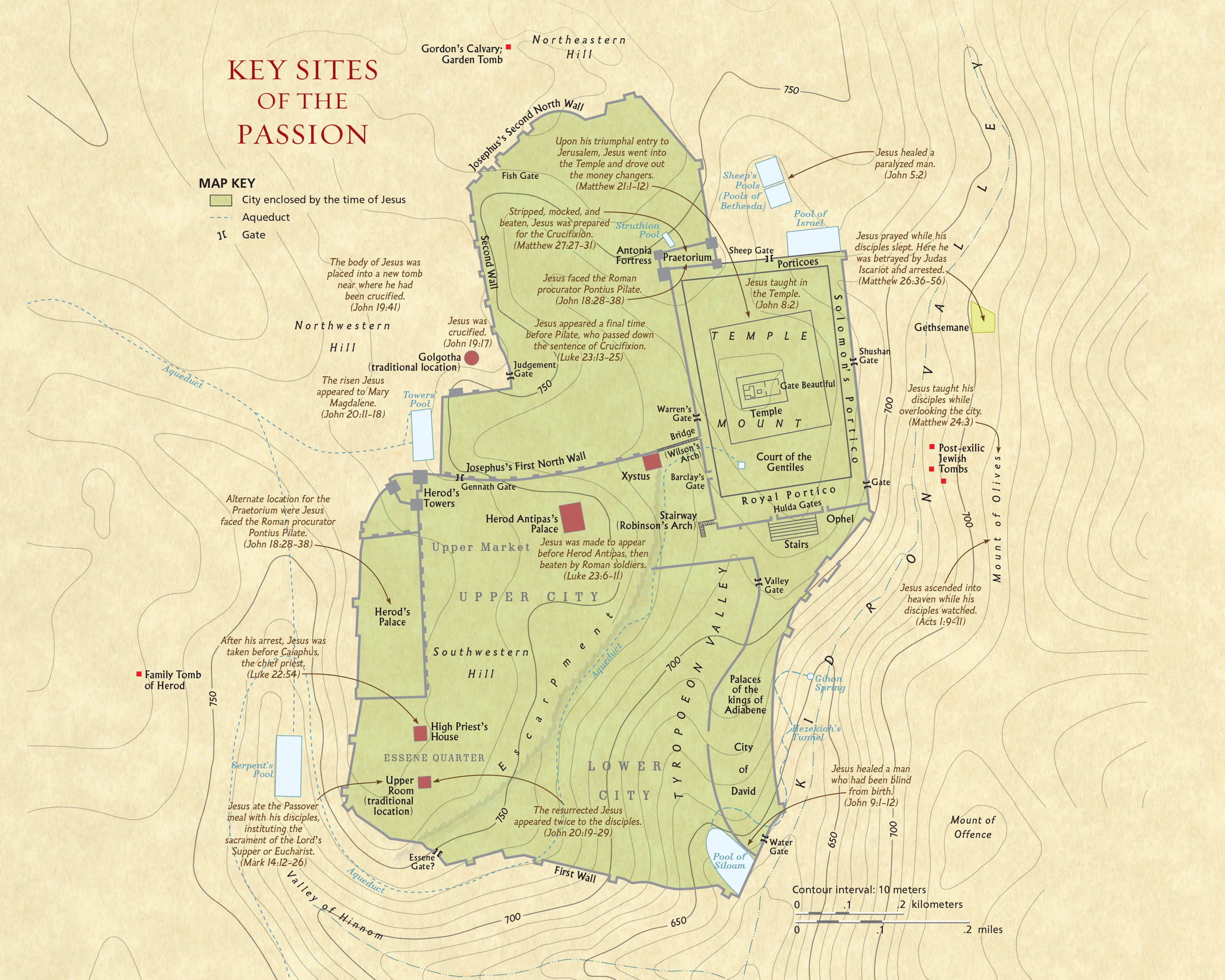
The original version.
