I think history is important, and anything that helps us understand it is vital. Looking through stories for USA Today’s D-Day tabloid I designed and paginated, I saw several information gaps that could be filled in to help readers better comprehend the story.
I came up with the idea of giving stories history notes — small boxes with facts relating to specific stories. I researched and wrote 15 notes and strategically placed them throughout the publication, one note per page. A few are below:
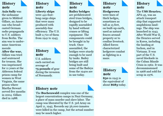
Some of the history notes that ran in the D-Day tab.
A brief aside: The germ of the idea came from the writer Harlan Ellison. I’m a big fan of his, and in one of his college lectures he mentions being questioned by an audience member:
“I usually get most of your references,” she says, “but who was that last one? Dock-something?”
“Dachau?” Ellison says. “You mean Dachau?”
“Yes,” she says, “who’s that?”
I thought of that exchange while reading a tab story about a soldier who was part of the liberation of Buchenwald. Just as a test, I asked several people in the office — younger, college-educated professionals — if they knew what Buchenwald was. They didn’t.
History notes were inserted into page margins.
The story identified Buchenwald as the infamous slave-labor camp but my added note described it and included the day of liberation and estimated number of deaths. It made Buchenwald harder to forget or overlook, I hope.
After that, I started looking for other note opportunities. Some were purely for points of reference: the value of $50 in 1943, adjusted for inflation today, was one. Bailey bridges were fascinating marvels of simple engineering.
Another was about hedgerows and what a nightmare they were in combat throughout northern France. Hedgerows weren’t the decorative hedges in front of your house, in other words.
Others were U.S. Navy ships mentioned in stories — whatever happened to those ships, I wondered.
Though each note was short and to the point, they gave readers a bit more information that put D-Day in perspective and gave a greater understanding of what it was all about.